MY ROLE
UX DESIGNER | RESEARCHER
TOOLS
TOOLS
TOOLS
FIGMA, FIGJAM
FIGMA, FIGJAM
FIGMA, FIGJAM
TIMELINE
SEP - NOV 2023
CLIENT
NATIONAL OCEANIC ATMOSPHERIC ASSOCIATION
NOAA GLANSIS REDESIGN
A case study of my website re-design for NOAA GLANSIS - a database for tracking non-native species within the Great Lakes.
Collaborating with the client, the redesign focused on enhancing usability for its diverse audience.
AAFAF SOPHIA
AAFAF SOPHIA
AAFAF SOPHIA
©2024 AAFAF SOPHIA MOUSTAFA
Go Back To Top
©2024 AAFAF SOPHIA MOUSTAFA
Go Back To Top
©2024 AAFAF SOPHIA MOUSTAFA
Go Back To Top


…to this!
…to this!
…to this!
At a glance…
01
hello
NOAA GLANSIS is a national database that provides vital, comprehensive information on non-native species in the Great Lakes region.
What is NOAA GLANSIS?
02
How might we redesign the NOAA GLANSIS site to better support its diverse audience?
Problem Statement
03
Solution

Going from this…

01
What is NOAA GLANSIS?
The redesign enhances clarity and practicality by prioritizing a simplistic, intuitive navigation for all users, which further promotes site engagement and ease of use
Design Thinking Process
Initial Client Insights
Website Review
Competitor Analysis
01.
Research
Problem Statement
Identify User Needs
02.
Define
Create LoFi Mockups
Iterate on Feedback
Interactive HiFi Prototype
03.
Ideate
Final Prototype
Major Redesigns
Key Design Decisions
04.
Final Product
Client Presentation
Conclusion
05.
Reflection
RESEARCH
Client Insights
The NOAA GLANSIS Ambassador provided a detailed debrief, highlighting key pain points of the site and offering valuable insights to guide the redesign.
The NOAA GLANSIS Ambassador provided a detailed debrief, highlighting key pain points of the site and offering valuable insights to guide the redesign.
The NOAA GLANSIS Ambassador provided a detailed debrief, highlighting key pain points of the site and offering valuable insights to guide the redesign.
Overview: GLANSIS is an interagency program, launched as a scientist-to-scientist database in 2003, with redesigns in 2010 and feature expansions through 2022.
A upcoming migration to WordPress and USGS API improvements are planned for 2024, making this an ideal time for a redesign.
The site serves a diverse audience: Great Lakes researchers, natural resource managers, AIS decision-makers, and K-16 educators.
Key Features:
Key Features:
Key Features:
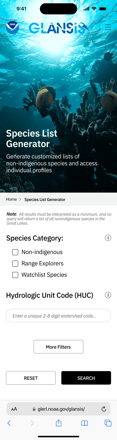
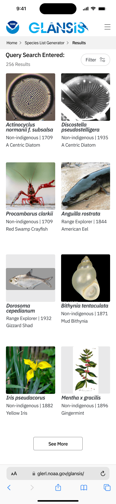
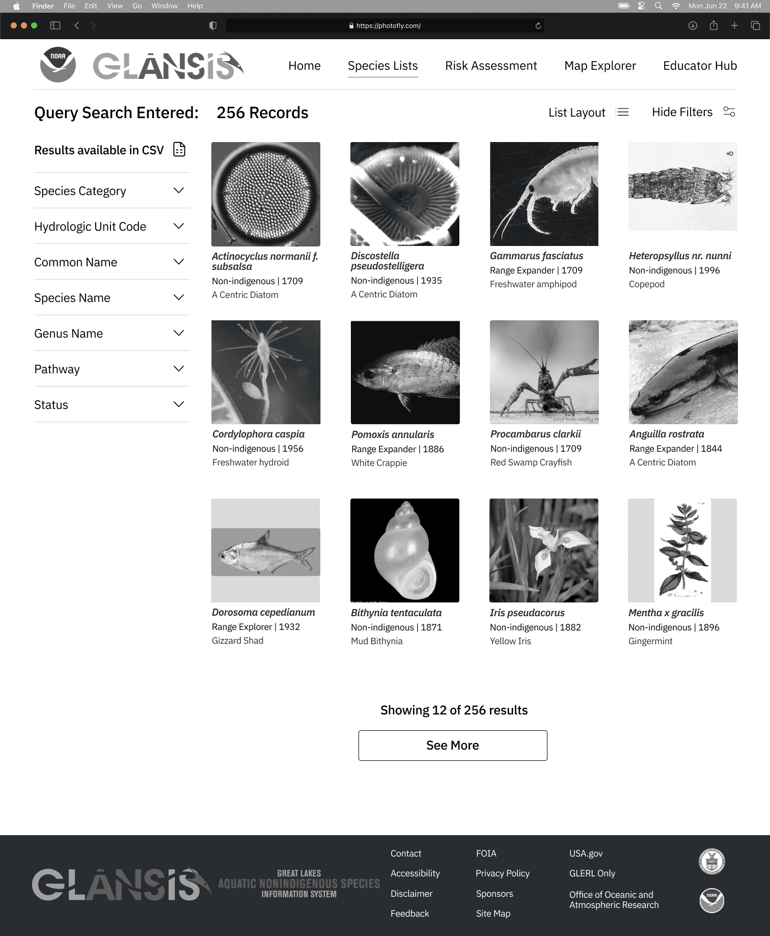
Species List Generator: Allows managers to create species lists using HUC codes.
Risk Assessments: Used by managers for informed decision-making.
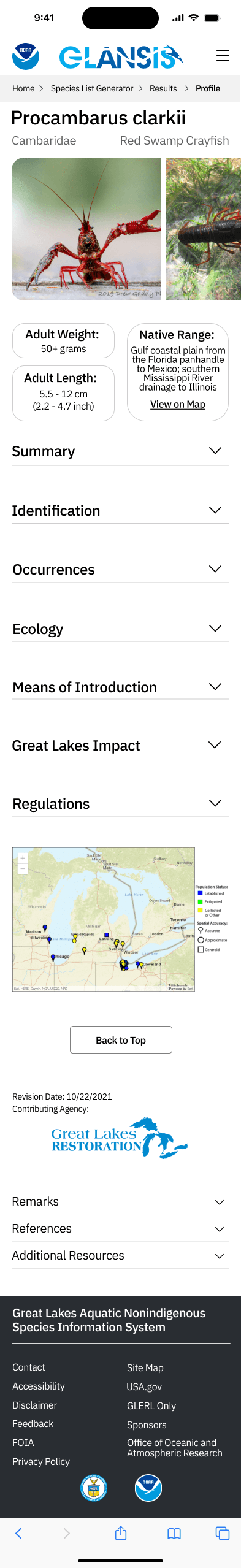
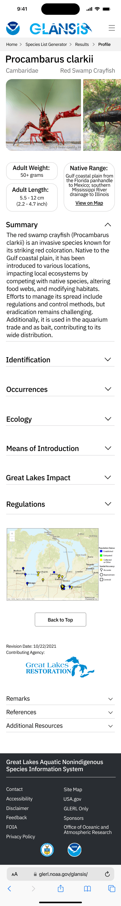
Species Profile Pages: Offer detailed information on species.
Downloadable Assets: Users can generate PDF reports
Pain Points:
Poor navigation, making it hard for users to find information.
Profile pages, where all users eventually end up, are clunky and hard to use.
Lack of responsiveness and difficulty navigating back to the homepage.
Biggest Concern: Focus on profile page redesign, better filtering, modernizing the site, and ensuring seamless navigation.
Research
Research
Research
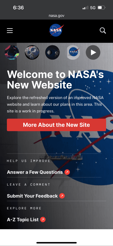
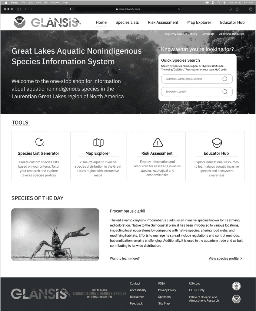
NASA's Mobile Landing Page
RESEARCH
Competitor Analysis
In my competitor analysis, I explored three key platforms to gather insights for the redesign of the NOAA GLANSIS website, intentionally looking beyond just other science and data websites to examine platforms that effectively showcased the features I aimed to redesign. I also reviewed NOAA's other webpages to ensure continuity in the design of the parent platform.
In my competitor analysis, I explored three key platforms to gather insights for the redesign of the NOAA GLANSIS website, intentionally looking beyond just other science and data websites to examine platforms that effectively showcased the features I aimed to redesign. I also reviewed NOAA's other webpages to ensure continuity in the design of the parent platform.
In my competitor analysis, I explored three key platforms to gather insights for the redesign of the NOAA GLANSIS website, intentionally looking beyond just other science and data websites to examine platforms that effectively showcased the features I aimed to redesign. I also reviewed NOAA's other webpages to ensure continuity in the design of the parent platform.
I examined NASA's mobile landing page for its intuitive user navigation and clear content presentation.
Taking note of:
Clear information hierarchy
Use of background image
Content Grouping
Nike's Grid Layout
For the Species List Generator output page, I looked to Nike's grid layout focusing on their seamless, clean, and minimalistic design. This structure facilitates quick browsing and allows users to navigate effortlessly.
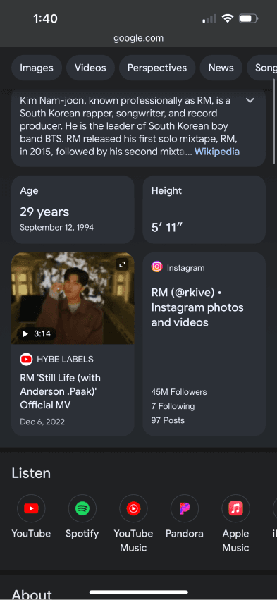
Google's Profile Description
When looking to redesign the Species Profile Pages, I was inspired by Google's content organization, which maintains clarity without overwhelming users.
Noting:
Ability to expand and collapse relevant information
Providing tons of content, while minimizing clutter


RESEARCH
Website Review
From the NOAA GLANSIS website review, I learned that the site lacked intuitiveness and had a dated design that significantly impacted user experience. Key observations included:
The navigation was cluttered and difficult to follow, making it hard for users to find information quickly.
There was no clear information hierarchy, resulting in confusion about where to locate specific data.
The site was un-responsive, leading to usability issues on mobile devices.
Overall, the design felt outdated, which affected user engagement and accessibility.
These insights highlighted the need for a multi-platform redesign to reduce cognitive load, improve usability, and enhance the overall experience.
DEFINE
Problem Statement
The NOAA GLANSIS site could be a fantastic tool for gaining accurate data on non-native species within the Great Lakes, however, the site
is ill-equipped to handle its diverse audience. Ranging from elementary school students to local resource managers, users have reported feeling confused and overwhelmed by the site's design and structure, therefore limiting its value and practicality.
How might we redesign the NOAA GLANSIS site to better serve its diverse audience, ensuring that users—from elementary school students to local resource managers—can easily navigate the platform and access accurate data on non-native species in the Great Lakes?
DEFINE
DEFINE
DEFINE
Identify User Goals
User goals for the NOAA GLANSIS site vary by screen, focusing on accessing accurate data, navigating intuitively, utilizing relevant tools, and engaging with educational content to enhance the overall user experience.
Landing Page:
Clear information hierarchy
Essential tools and resources should be accessible
Navigation should be intuitive for easy exploration
Design should be uncluttered, focusing on key content
Species List Input Form:
Easily generate species lists with geographic codes (HUC).
Search intuitively for their intended species
Clear layout for filtering options
Navigate efficiently without confusion
Generated Grid Output:
Easily view species lists and related data
Intuitively view data about each species
Options to export data as PDF reports
Species Profile Page:
Users seek detailed information on specific species
Clear layout for easy navigation
Easily view the relevant content, ignoring excess clutter
Define
Define
Define
Project Overview
Project Overview
Project Overview
Over the course of nine weeks in my Intro to UX Design class, I undertook a client-based redesign of the NOAA GLANSIS website, focusing specifically on the Species List Generator feature, which the client identified as a significant pain point. I conducted a competitor analysis and performed a deep dive into the original platform to identify strengths and weaknesses. This research informed my design decisions as I created low-fidelity wireframes and high-fidelity prototypes for both mobile and desktop platforms using Figma. Following usability testing, my user-centered redesign aimed at enhancing usability and accessibility was chosen as one of the top five projects from a class of over 200, culminating in a presentation to the client at the end of the semester. My work was also showcased as a 2023 UMSI Theme Year Project.
The Challenge
The Challenge
From elementary students to local resource managers, the current design leaves its diverse audience feeling confused and overwhelmed, thereby limiting its usefulness and practicality.
The Opportunity
Collaborate with the client, and deliver a multi-platform redesign that allows for all users to intuitively interact with the platform
The Statement
The Statement
The Statement
How might we redesign the NOAA GLANSIS site to better support its diverse audience?
IDEATE
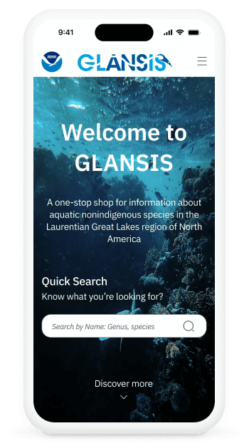
LoFi Mobile Mockup

Increase height, make spacing consistent, align elements
Good job on this one! Looks clean
Maintain font and icon continuity


Increase height, make spacing consistent, align elements
Good job on this one! Looks clean
Maintain font and icon continuity
Use same typeface everywhere

Maintain button style throughout
Ideate
Ideate
Final Product
Final Product
FINAL PRODUCT
Final Designs


IDEATE
Incorporating Feedback
Incorporating client and user feedback was crucial in refining my design and ensuring it met user needs effectively.
Client Feedback:
Simplify the interface to make intuitive for all users
Most users only use the HUC codes and species category search fields
Cater to the diverse user base
Legibility and Icons:
Refine the platform's aesthetics for a cleaner design
Implement uniform icons for visual consistency
Improve legibility by refining font choices and stroke widths
Strengthen the platform’s visual identity
Diverse Audience:
Use clear language and intuitive design choices to cater to a diverse audience
Ensure the redesign creates an inclusive user experience for all backgrounds and expertise levels
Simplify the Design:
Simplify the overall design to enhance user comprehension
Declutter the interface: reduce visual elements and complexities
Create a more straightforward, user-friendly design
IDEATE
HiFi Desktop Prototype


FINAL PRODUCT
Video Demo
Click to view video demo
Click to view video demo
Reflections
Reflections
REFLECTIONS
Client Presentation
I was honored to be chosen as one of five students, from a class of over 150, to present my final NOAA GLANSIS redesign to the client. The experience was both nerve-wracking and exciting, as it was my first time presenting my work outside of a classroom setting. I learned how to communicate my design choices in a way that went beyond technical or design terms, focusing instead on what would resonate with the client. It was a valuable challenge to explain my thought process clearly, making sure the client could see how my decisions would improve the user experience in ways she could appreciate. Presenting my work to the client was a great opportunity to grow my communication skills, and despite the nerves, it was incredibly rewarding to share the results of my hard work and see it appreciated by the client.
REFLECTIONS
Conclusion
This project marked my first major redesign, and it was an incredible learning experience from start to finish. Working directly with a client gave me invaluable insight into the full UX design process, from concept design and wireframing to creating high-fidelity prototypes. Along the way, I deepened my understanding of key design principles and how to implement them effectively. The experience ignited a true passion for design, and being selected as one of the top projects—and showcased as an exemplary UMSI 2023 theme year project—was the perfect culmination of all the hard work. This project not only taught me so much but also reinforced my love for design and user-centered problem-solving.

IDEATE
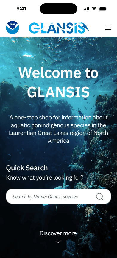
HiFi Mobile Prototype
IDEATE
Key Design Decisions
01
Versatile Filtering
Versatile filtering was a key design decision in the NOAA GLANSIS redesign, addressing the diverse needs of users while maintaining simplicity and utility. By implementing two search options— a simple search with primary filters for quick access, and a detailed search for researchers requiring more in-depth options— the design ensures both accessibility for resource managers and flexibility for researchers. This user-centric approach strikes a balance between ease of use and the depth needed to engage a diverse audience effectively.
02
Dynamic Views
Dynamic views were a pivotal design decision, featuring a "Hide/View Filters" option on the results page. This allows users to toggle filter visibility, optimizing display space for a larger, focused content view. By enabling quick, context-specific search edits without navigating away, this adaptability enriches the user experience. Moreover, aligning with familiar conventions seen on other results pages enhances usability. The fusion of streamlined exploration, convenient sorting, and clean, adaptable views culminates in a polished and user-friendly experience.
03
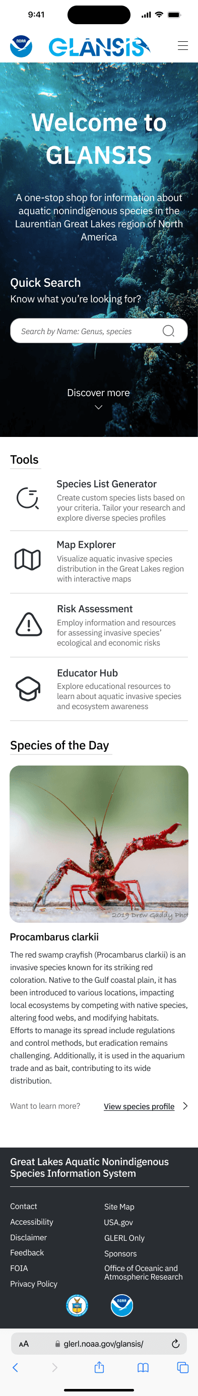
Species of the Day
Introducing a "Species of the Day" feature on the NOAA GLANSIS website brings multifaceted benefits, primarily enhancing user engagement through a dynamic, regularly updated focal point. This feature mirrors successful research platforms like NASA, fostering sustained interest and encouraging repeat visits. By diversifying content, it caters to a wide range of audience interests—from students seeking educational material to researchers needing specific information. Additionally, this strategy aligns with contemporary user expectations, promoting familiarity and ease of use across a broad spectrum of visitors.
Introducing a "Species of the Day" feature on the NOAA GLANSIS website brings multifaceted benefits, primarily enhancing user engagement through a dynamic, regularly updated focal point. This feature mirrors successful research platforms like NASA, fostering sustained interest and encouraging repeat visits. By diversifying content, it caters to a wide range of audience interests—from students seeking educational material to researchers needing specific information. Additionally, this strategy aligns with contemporary user expectations, promoting familiarity and ease of use across a broad spectrum of visitors.
NOAA GLANSIS
REDESIGN
ROLE
INDUSTRY
TOOLS
TIMELINE
CLIENT
MY ROLE
INDUSTRY
TOOLS
TIMELINE
CLIENT
NATIONAL OCEANIC
ATMOSPHERIC ASSOCIATION
UX DESIGNER | RESEARCHER
ENVIRONMENT, GOVERNMENT
FIGMA, FIGJAM
SEP - NOV 2023
ENVIRONMENT, GOVERNMENT
FIGMA, FIGJAM
SEP - NOV 2023
Project Overview
In my Intro to UX Design class, I redesigned the Species List Generator for the NOAA GLANSIS website, a key pain point highlighted by the client. Through competitor analysis and research, I developed wireframes and high-fidelity prototypes for both mobile and desktop using Figma. My user-centered redesign was selected as one of the top five projects from over 200 students and presented to the client. It was also showcased as a 2023 UMSI Theme Year Project.
THIS IS NOT THE COMPLETE PROJECT
VIEW ON DESKTOP FOR FULL PROJECT DETAILS
Going from this…

…to this!
At a glance
Problem Statement
How might we redesign the NOAA GLANSIS site to better serve its diverse audience, enabling users—from elementary students to resource managers—to easily navigate and access accurate data on non-native species in the Great Lakes?
Research
RESEARCH
Client Insights
The NOAA GLANSIS Ambassador provided a detailed debrief, highlighting key pain points of the site and offering valuable insights to guide the redesign.
Pain Points:
Poor navigation, making it hard for users to find information.
Profile pages, where all users eventually end up, are clunky and hard to use.
Lack of responsiveness and difficulty navigating back to the homepage.
Biggest Concern: Focus on profile page redesign, better filtering, modernize the site, and ensure seamless navigation.
RESEARCH
Website Review
In reviewing the NOAA GLANSIS website, I identified issues like cluttered navigation and complex filters that hindered user experience. There was also a need for a mobile-friendly view and a less overwhelming layout. This research emphasized the importance of a simplified, intuitive interface with consistent visuals, guiding my redesign to enhance usability and overall user experience.
RESEARCH
Competitor Analysis
NASA's Mobile Landing Page
I examined NASA's mobile landing page for its intuitive user navigation and clear content presentation.
Taking note of:
Clear information hierarchy
Use of background image
Content Grouping
Nike's Grid Layout
For the Species List Generator output page, I looked to Nike's grid layout focusing on their seamless, clean, and minimalistic design. This structure facilitates quick browsing and allows users to navigate effortlessly.
During this stage, I created a clear problem statement addressing user challenges on the NOAA GLANSIS site, such as navigation difficulties and information overload. I also established specific user goals focused on intuitive navigation and easy access to accurate data on non-native species. This foundation ensured the redesign aligns with the diverse needs of users, from elementary students to local resource managers.
Define
Good job on this one! Looks clean
Good job on this one! Looks clean
Ideate
IDEATE
LoFi Mobile Mockup
IDEATE
Incorporating Feedback
Maintain font and icon continuity
Make spacing concistent, align elements
Match typeface and iconography
Gained more insight into the platform from the client
Highlighted how most users use the HUC codes and don't need complex filtering
IDEATE
HiFi Mobile Prototype
IDEATE
HiFi Desktop Prototype
Final Design
FINAL PRODUCT
Final Designs
FINAL PRODUCT
Video Demo
REFLECTION
Conclusion
Working on the NOAA GLANSIS redesign, I learned the value of user-centered design principles. I discovered how to balance functionality and aesthetics, simplifying complex features for better usability. Feedback throughout the process helped refine my choices, and presenting to the client was both nerve-wracking and rewarding. This experience strengthened my skills and deepened my passion for creating impactful user experiences.
Reflection
AAFAF SOPHIA
©2024 AAFAF SOPHIA MOUSTAFA
Go Back To Top
©2024 AAFAF SOPHIA MOUSTAFA
Go Back To Top
Go Back To Top
THIS IS NOT THE COMPLETE PROJECT
VIEW ON DESKTOP FOR FULL PROJECT DETAILS

Click to view video demo
Click to view video demo